Avada Websites are common because the Avada Theme is one of the most popular WordPress themes. I’ve worked with it many (too many ?) times. One of the reasons, it seems to me, is that they offer a lot of Avada Website pre-built sites. But another reason is that many “designers” like to lock clients into a permanent relationship by using it because it is hard for a novice WordPress user to master. Last week I ran into one of those situations.
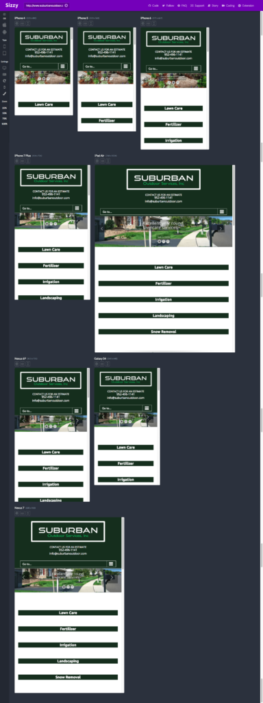
The client had not been able to get his developer agency to clean up the service boxes which were populated with cheesy art icons. Nor was he able to get the site to look as good on mobile as he would like. He had fired the agency and they had deleted the custom Google map they had built him for his service area and removed the Avada license so that no new widgets could be added. And, in addition, his logo designer wasn’t able to deliver the new logo he was looking for.
I tried to persuade him to let me rewrite the website using Astra & Elementor but he wasn’t willing to make that leap. So I agreed to fix the site using straight up coding skills and a fairly good knowledge of the Avada Theme from past experiences.
Since he no longer had the Avada license, I couldn’t add a button widget so I used CSS to convert the service box links into button looking boxes that changed color on hover. I quickly created a new service area Google “my map” and edited the half baked logo the “graphic artist” had made. I used Google dev tools to uncover the css that was generating the sticky header logo, on scroll and the Avada Customizer to load the 2 new logos.
Result: great looking site on both desktop and mobile for about $100! ?

