Elementor Blog Posts & Shaped Pixels
A Happy WordPress Marriage
I think one of the things that irritates me the most is the way that people promote sucky products. I love Elementor but I don’t love the gratuitous promotion of so many bad products. Hey, I’m not going to be “naming names”. But the reason many people join discussion groups is to promote something. And then there are those of us who join them to improve our skills. 😆
The Elementor Facebook Group is a place where you find both. Sometime ago I mentioned my favorite themes, Shaped Pixels, and got only negative comments because his website only featured his Premium Themes. There is a bit of a bigotry in the WP community about it being essential to have a free version of any theme. Andre has free versions of every theme but it is a well known fact that the theme approval process on WordPress.org is broken. So it takes months for his new theme’s free version to get approved.
As a result, the most promoted theme in the group seems to be Generate Press. And I like the theme. Let me rephrase that, I really like the theme. But, in my experience, Shaped Pixels offers more free themes with more features. Generate Press free themes are all simply Child Themes of the one theme. But this isn’t a theme comparison blog article. It’s about using Elementor for Blog Posts.
The most important theme feature, in my opinion, is the ability to choose whether or not to show the traditional blog sidebar or not. Shaped Pixels has three options, with Right, with Left or with No Sidebar:
![]()
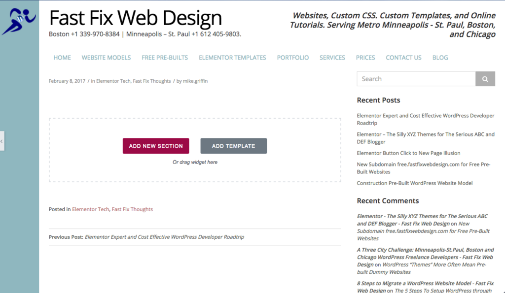
When you chose with right sidebar the edit page shows the sidebar so you can use Elementor to create the page around it.

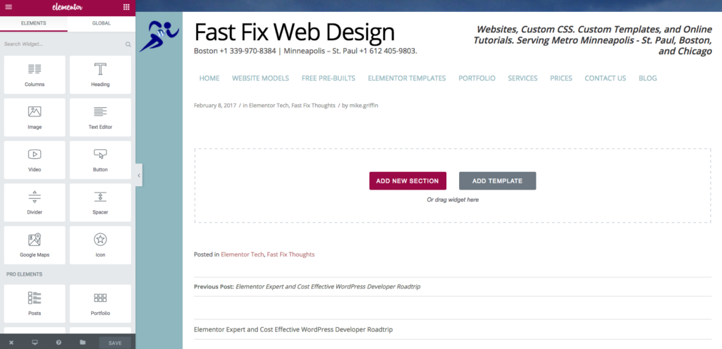
The option that I use is with no sidebar.
![]()
Which results in a beautiful full page canvas for the post.

The other two things I like to do is 1) Hide the title that WordPress Inserts into the page, either with CSS or with a Plugin and 2) Set a Featured Image but hide it on the post so that is only used on my Masonry or Grid format Blog page.

