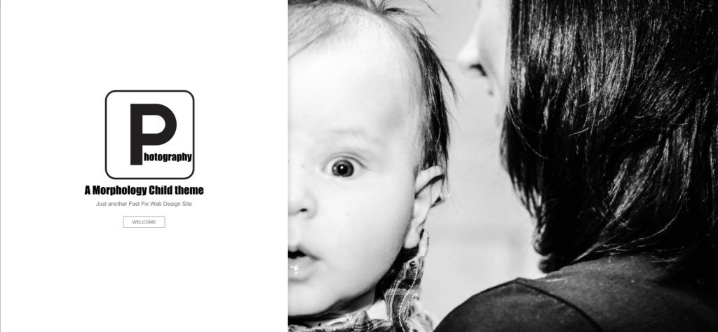
This week I updated an old Flash website for a client. The old Flash website had resulted in some crazy Google search results! The client and I looked at several websites that she liked from similar local businesses. She really liked one site that featured the nav menu in a panel on the side of the page. I immediately thought of Morphology by Shaped Pixels. I have a site demo of its use with Elementor, Custom Photography Site, that uses a particularly striking photo from Griffin B Photography. So we chose to build the site with the Morphology Theme plus Elementor.

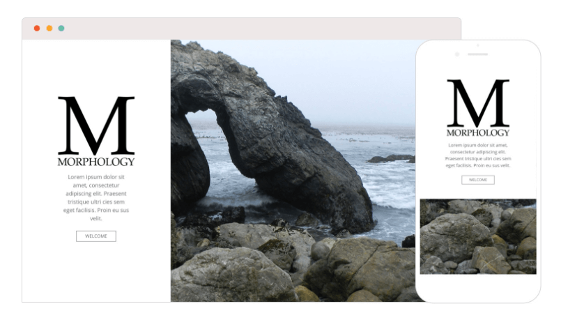
After building out the site, I noticed that the theme’s Splash landing page looks like crap on mobile devices. It uses a background image and the image just won’t size right. You can notice that right away if you look at the Shaped Pixels demo site. On mobile, you only see the rocks and not the striking arch.

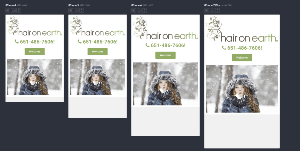
So, instead of the theme splash landing page I build the home page in Elementor. It looks great on mobile devices.

In the final analysis, all I really needed the Morphology Theme for was the side panel menu.
![]()
