I’ve recently completed the translation of a German website into an English version. The German website was entirely html, css with heavy use of JavaScript and, in particular, the JavaScript/jQuery implementation of the Revolution Slider. The Revolution Slider is hugely popular and also available as a plugin for WordPress, But I prefer Smart Slider 3 which WPMUDEV touted as the Best Slider Plugin just last year.The site needed 25 sliders to replicate the sliders on the German version, so having a powerfull yet easy to use Slider Plugin was essential to building the site. In another blog post, I’ll outline how I built the sliders that appear on the English version of the German site. But this post is about the German site’s Gallery page.
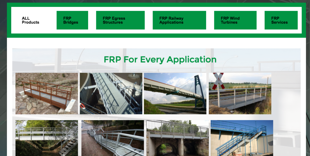
The Gallery page on the German site reused many of the pictures from sliders within the site using button headers to switch between galleries. It seemed to me that reusing the sliders would be a more efficient design decision. The challenge was in making a page with “button triggered” gallery content. The approach I used was the Tabs widget and some CSS to make them the tabs look more like buttons than tabs. I gave the color and background color with the Elementor UI interface and then made the “buttons” with CSS
.active{

 color:#000000;

}

.elementor-tabs .elementor-tabs-wrapper {

 padding: 1rem;

}

.elementor-widget-tabs .elementor-tab-desktop-title {

 position: relative;

 padding: 20px 25px;

 font-weight: 700;

 line-height: 1;

 border: solid black;

 border-color: white;

 border-width: 15px !important;

}
The ability to use Custom CSS only comes with the Pro version, but I have an unlimited domain license so all customers of Fast Fix Web Design get the pro version included with their site for no charge. The final product looks like this:

