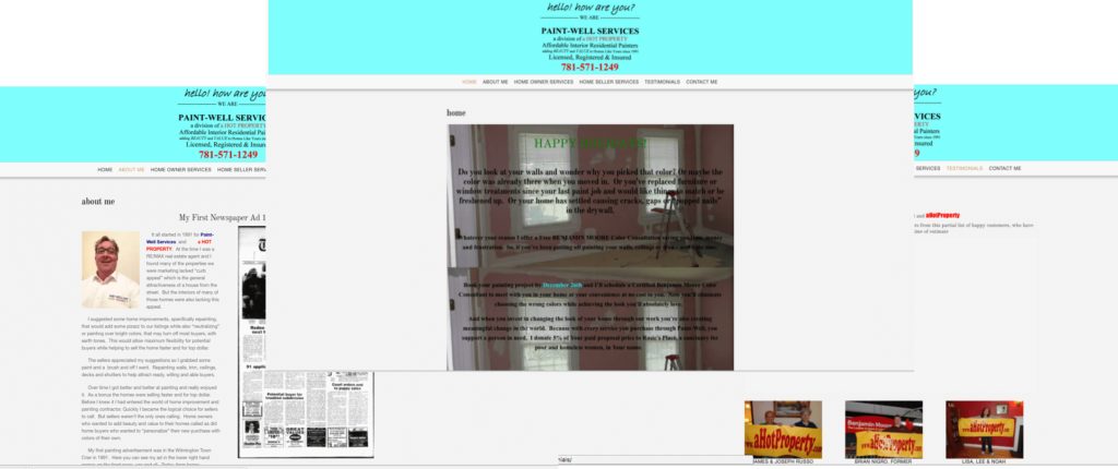
This is another example of how theme like Emotions can be made to look exactly like you want the site to look. My customers know their business and, from experience with print media, they know what works for their customers. They also know how they want the landing page to work. This customer wanted the background image to be a room he was painting with the text scrolling over the room as the user scrolled down the page. The user learned how to change the fonts with the advanced WordPress Visual Editor and change the site to fit what he wanted. In the whole page screen shot, the background image appears as the same image over and over, but that is the nature of the screen capture software on long sites with a fixed background image. On the live site it scrolls.
Emotions starts out looking like this:

Then the client gives us direction on how they want their site to look. In the case of this client, it ended up looking like this:

We are happy to deliver what you want!
