Fix Elementor Sticky Header Anchor Overlap
I’m starting to post the solutions that I provide to clients so that they can be used by anyone who finds them on the web. This post is about how to Fix Elementor Sticky Header Anchor Overlap.
This is a problem common problem. I see it mentioned often in the Elementor Facebook Group. But I don’t post many solutions there because the majority of the posters lately don’t understand HTML or CSS so they would understand the solution.
Here’s how it comes about. You create a page with multiple sections and add an anchor to each section.

Then you add a link to the anchor in the menu.

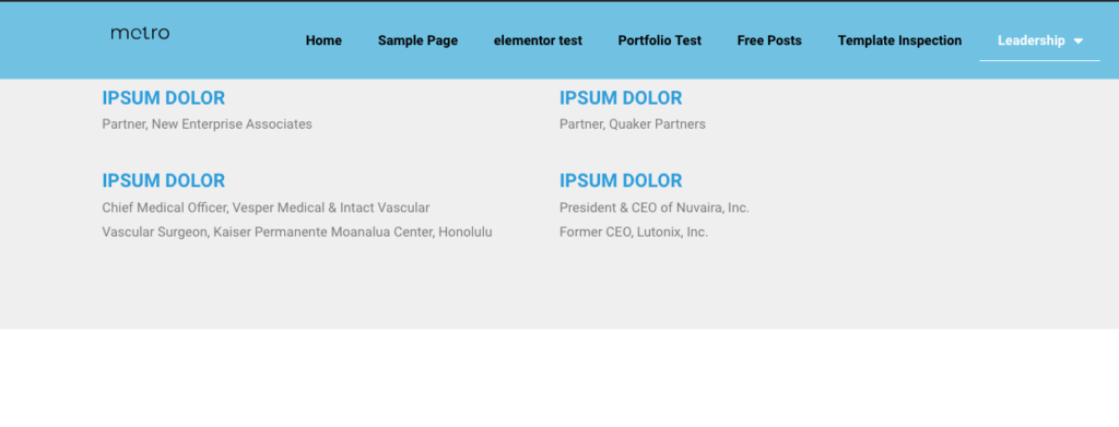
But when you click the menu link, your taken to the middle of the section because the Elementor Sticky Header overlaps the section.

The solution is some simple CSS:
[css]
#ANCHORID {
/* move anchor down */
display: block;
position: relative;
top: -200px;
}
[/css]
By definition each Anchor widget has an ID so we apply the CSS to the widget.
Display: block displays the anchor like a a block element (like <p>). It starts on a new line, and takes up the whole width.
Position: relative positions the anchor relative to its normal position.
Top: -200px somewhat counter intuitively moves the anchor down from under the sticky header.
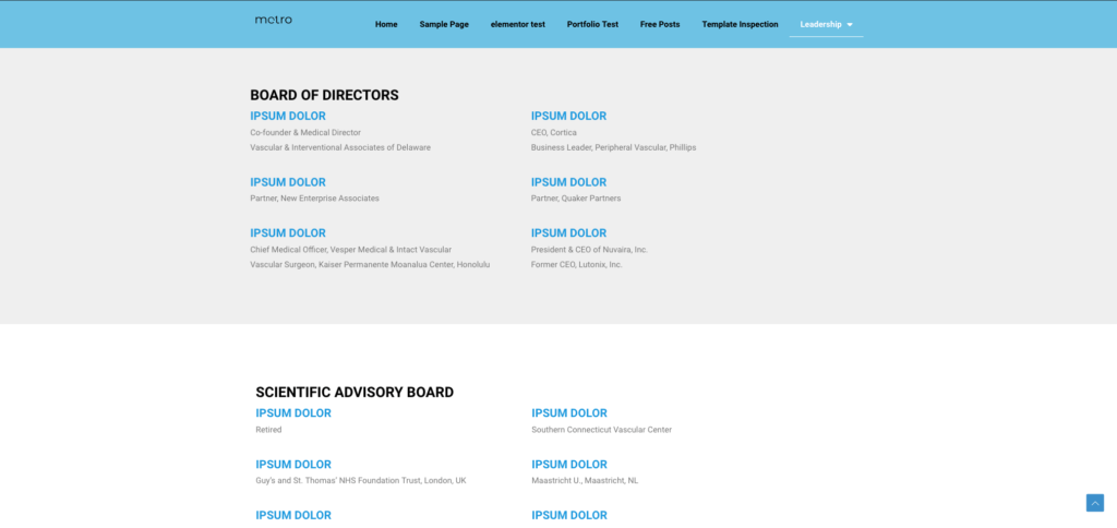
Once we add the CSS for the Anchor ID, the page opens with the title of the Board of Directors showing:

Here’s a short video that explains the whole process:
